Images courtesy of JMU Athletics Communications unless otherwise noted
By Bennett Conlin
The end of a JMU football bye week calls for a fun, yet relatively unimportant story. I’ve landed on a quick JMU football uniform ranking.
This ranking is, of course, subjective. Most fans have different uniform preferences, which is completely understandable.
Disagree with my ranking? That’s all good. Drop your favorite uniform combination in the comment section and tell me how I’m wrong.
3. The Classic: Gold Helmets
The gold helmets have grown on me over the years. I don’t necessarily love them, but I do appreciate that JMU’s colors are purple and gold. I dig the purple pants, purple jersey, gold helmet combination. It gets all the school colors into the uniform, and I think it looks decent.

I also like that the gold helmets are versatile enough to look good with all-black uniforms. Some fans feel strongly that the gold helmets stink. I used to be one of those fans, but I’ve since flipped and actually like the look of the gold helmets.
The gold helmets aren’t my favorite of JMU’s many helmets, but they’re toward the top of the list.
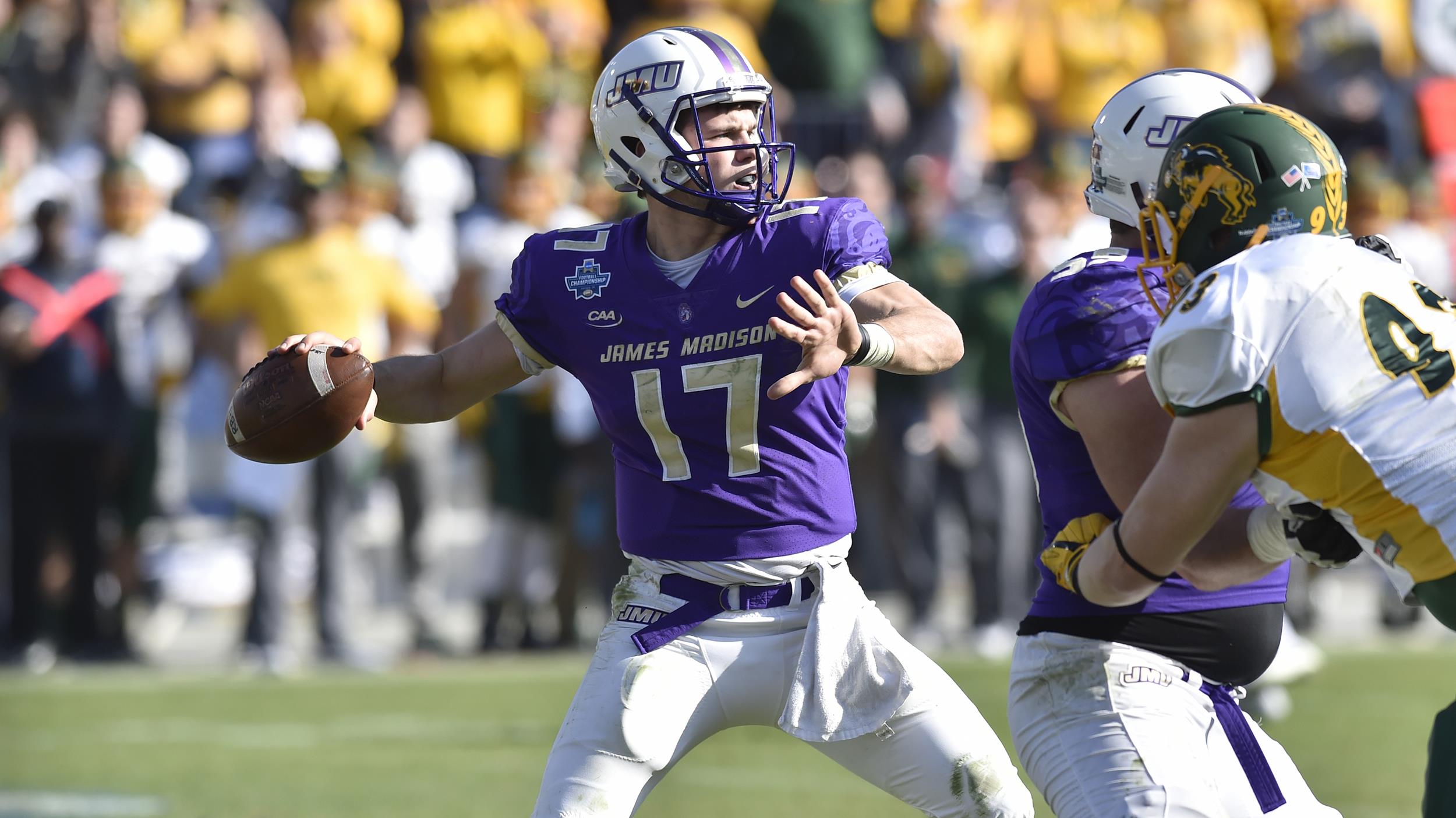
2. The new classic? White helmets, gold stripe
The Dukes’ uniform combination against South Alabama was nice. The purple jersey is a classic for the Dukes, and the white helmet with a gold “JMU” and a gold/purple stripe down the middle is a nice touch.
In a very “old man take,” I like when the uniforms don’t become a story. I also like when the neighborhood kids GET OFF MY LAWN.
Anyway … I’m fine if the Dukes don’t try to get as creative as they did during the Everett Withers era with uniforms. There were some stinkers during that time – more on that later.

The Withers era was entertaining, as the Dukes revealed new uniform combinations on a seemingly weekly basis, perhaps trying to find which combination would best help the Dukes tackle. None of them worked that well.
Still, JMU doesn’t need to attract recruits or attention with fancy uniforms thanks to the success of Withers’ teams and the significant national success during the Houston and Cignetti eras. The Dukes are good enough in 2023 to have the focus squarely on the team and still generate national headlines, rather than creating local and national buzz via uniform combinations or the occasional “College GameDay” visit.
The white helmets with the gold “JMU” are sleek, but they aren’t dazzling to the point of distraction. They’re solid! I’m good with solid uniforms.
1. Black uniforms and helmets
I love JMU’s all-black uniforms, especially when they rock a black helmet to go with the black pants and jersey.
Metallic Duke dog on a black helmet? Wow. The Dukes look awesome in these uniforms, and I love when they’re worn on a cold fall Saturday.

I don’t know why it needs to be cold, but these feel like late fall/winter uniforms. Thrashing Coastal Carolina in black jerseys in late November last fall just felt right.
The black pant/jersey combination also looks good, in my opinion, with purple or gold helmets. I’m a sucker for the black uniform combinations, which are by far my favorite of JMU’s many jersey and helmet combinations.
Can’t stand ‘em: Gray Virginia helmet
I appreciate what JMU was going for here, with the Dukes “owning the state” but they’re not good. I really don’t like the gray, and I don’t think having Virginia on the helmet makes much sense or feels necessary. It feels out of place, and the color combination is strange.

Let’s stick with a Duke dog logo or simply write out JMU. I think JMU got a little too creative with the gray/purple combination and map of Virginia helmet.
I’d be okay with these never seeing the light of day again.
Disagree with my thoughts? Share your thoughts on JMU football’s uniform combinations in the comments. Be sure to visit the team’s Helmet History page if you need some refreshing on the Dukes’ many helmets from over the years.


Leave a Reply